05.09.2025
"Flowers never fucking hurt anyone"
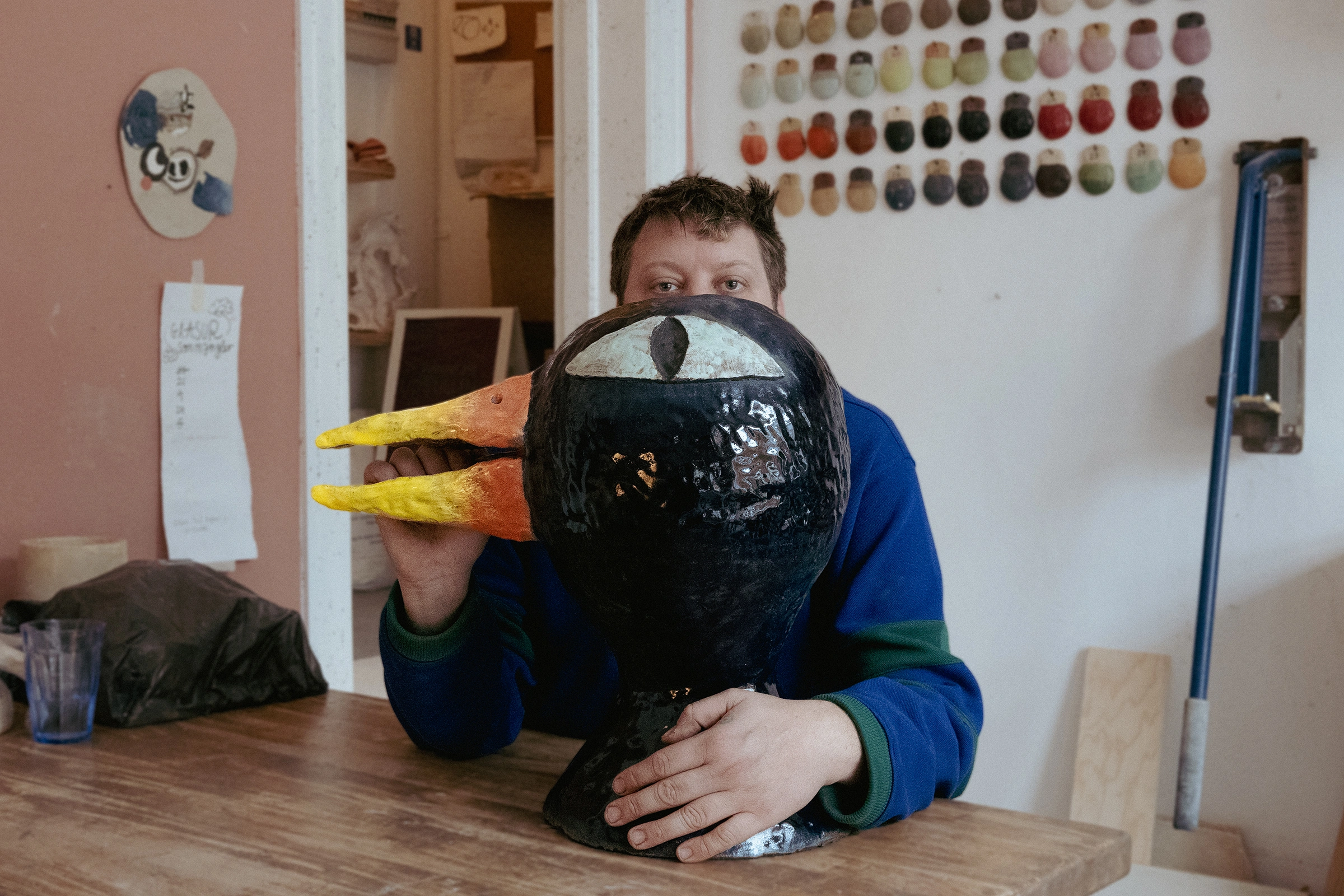
Interview with poster artist of the year Peter Larsen
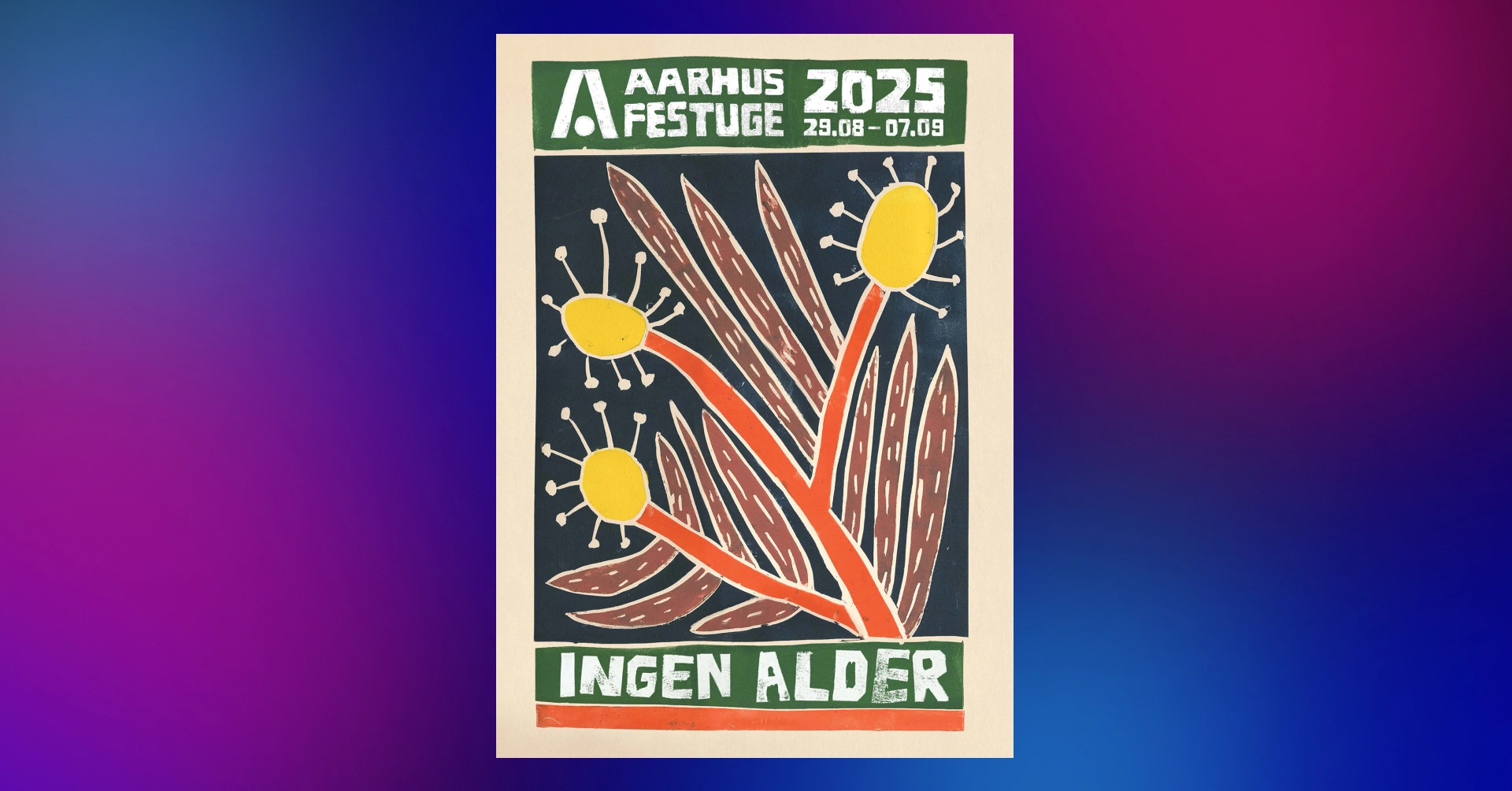
Buy the Festivalposter 2025Danish artist Peter Larsen has been given the honour of creating the poster for our 60th anniversary. Larsen usually fills his dreamy works with distorted figures and fantasy creatures. For the Festival Week poster, the artist has taken a different approach and created a colourful flower printed in linoleum.
We spoke to Peter Larsen about working on this year's Festival Week poster and how a simple flower has been liberating for his artistic work.
What were you thinking when we asked you to create the Festival Week poster?
I love illustrative work, so it was a no-brainer to say yes. It was a great pleasure to be asked. In a world where I might be a visual artist, I really enjoy sitting and drawing.
It's more fun to approach things in a way where I'm not the one who has to invent the deep dish. It reminds me of doing "real" work like people who underwater weld bridges.
Have you been to Festugen before?
I don't actually have a special relationship with Aarhus Festival, but I've played music for many years and have spent a lot of time in Aarhus as a result.
How would you describe your artistic style and universe to someone who doesn't know you?
I feel like I was put on this earth to explore how to make images. I see myself as a kind of pump. Everything in the pump is an investigation. If I want to understand Edvard Munch or Asger Jorn, I have to make something of theirs and then it becomes my own expression when it comes through the pump.
We gave you a challenge to relate to our anniversary theme 'No Age'. How did you approach this task?
I've experienced before that when a thing relates very specifically to something, it's often created based on other people's expectations. And then it doesn't actually turn out very well. I had other sketches, but I got too locked into meeting the festivals expectations. Instead, I kind of created my own theme within your theme.

How did you arrive at the final design?
A flower is part of nature and part of a cycle. It re-establishes itself every spring. In my mind, it's very timeless. If you look beyond the sun burning out at some point, nature has always been there and will always be there.
The theme came out of the blue. I was in Rome at Christmas and two ladies got into a fight in the street in front of me. All of a sudden it came to me: "Oh, this is just too much. I'm going to go and make a flower". Flowers never fucking hurt anyone. I was just really happy with the result. I liked that it wasn't so obvious.
How did you create the poster piece?
I knew I wanted to do some kind of graphic print. I wanted it to be colourful. It ended up being linocut. There was a graphic workshop at the Danish Institute in Rome that I could use. It was great to be in a different place with different things available and a new piece of work.
In my head, the flower is quite an abstract piece. It's colours that relate to each other out of context. When the linoleum sheet wasn't assembled, it was just coloured shapes.
In several of your works you work with almost satanic figures. Weren't you tempted to take on the Festival's own satyr, Pan?
Many of my scenarios are usually very cryptic with a distortion of reality. But I'm at a place in my life where I want to embrace the simple. I found great joy in drawing flowers. I wanted it to be straightforward.
The flower is an intermediary that can point in a more formal or formalistic direction. Working on posters for you has opened the door to doing newspaper illustrations and the like, which is really cool.
How do you feel about the fact that your poster gets to live throughout the city and videos and the like are made over your original print?
It's super cool. If I'm anything, I'm a folk artist. I've always compared myself to Henry Heerup.
I could be an artist who said nothing. But I'm not there. What I do is not rocket science. Other people's input people's ways of doing things are just as good as my own. It's very nice that the work is alive, and really cool that your graphic designer, for example, has cut out letters and printed them on top of the poster. Things should be used and things should be enjoyed.


